Cape Town’s Map of Water Usage has Residents Seeing Red
The latest weapon in Cape Town’s water saving arsenal is a map that exposes private meter readings to public scrutiny. The initiative has been launched as the South African city enters the third year of its worst drought on record. Unless residents can cut their daily water use to 87 litres per person, city authorities […]

The latest weapon in Cape Town’s water saving arsenal is a map that exposes private meter readings to public scrutiny. The initiative has been launched as the South African city enters the third year of its worst drought on record. Unless residents can cut their daily water use to 87 litres per person, city authorities estimate that the taps will run dry on 21 April 2018.

The “City Water Map” has just been launched in an attempt to make a dent in the 200 000 homes going over the limit of 10 500 litres per month. That’s 87 litres per person per day for a family of four, a limit that was imposed at the beginning of the year as part of the city’s level six water restrictions.
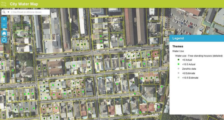
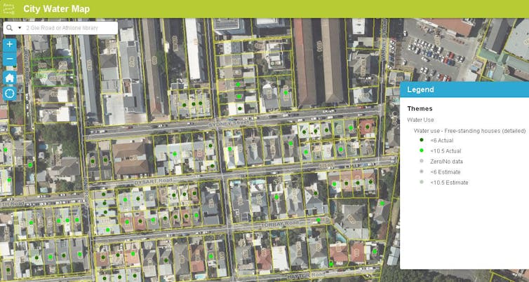
The Water Map’s landing page provides a bird’s eye view of the City of Cape Town municipality, as it appears on Google Maps. Zooming in to individual properties reveals the street address and the plot number as well as the water usage level. The plots of users who are within the water restriction limit are marked with a green dot.
The city authorities behind the map have gone to great lengths to design it in a way that highlights those who are sticking to the water restrictions, rather than naming and shaming those who don’t.
They say the aim is to publicise households that are saving water and to motivate others to do the same. They even dropped an earlier idea that a red dot should appear on plots where restrictions were being broken.
The map has nevertheless sparked controversy. Notwithstanding the mayor’s positive rhetoric to “paint the town green”, some members of the public are seeing red.
Arguments against it include that it’s a violation of privacy, that it’s divisive and that it could promote the harassment of properties.
The map applies a theory developed by the University of California in 2015 that households will drastically reduce their water use when they realise they are the odd one out in a water-saving neighbourhood.
Cape Town seems to be one of the first municipalities to actually apply the theory.
How the Map works
Properties are marked by a colour-coded dot. A dark green dot indicates properties with a meter reading of less than 6 000 litres in the previous month. A light green dot indicates properties with meter readings over 6 000 litres but below the limit of 10 500 litres in the previous month.
There are also grey dots with dark or light green centres. The dark centres are for water usage that’s estimated to be 6 000 litres. Light green centres are for 10 500 litres.
Pure grey dots apply to properties where the meter read zero in the past month or for which no meter reading exists. Some properties aren’t assigned a dot. These include properties over the limit as well as properties that are not included in this version of the Map, such as commercial and industrial properties and flats.
Unfair targeting
The strength of the Water Map is its potential to apply social pressure to encourage water savings. Social pressure exerts a powerful influence and shapes behaviour. By allowing the public gaze to fall on every residential property in the municipality, the Water Map renders homes publicly accountable for their water use.
And rightly so, as water saving is a combined effort. Without this accountability, a common resource such as water is vulnerable to exploitation by a few, at the cost of the whole.
But there is a danger to this strategy. Strong social norms promoting certain behaviour can fragment society, creating a sense of “us” and “them”. In this case, “water savers” may stigmatise perceived “water wasters”. This would break down the cohesion that’s needed for citywide water saving.
Patricia de Lille, the mayor of Cape Town, is clearly aware of this potential pitfall. As she explained:
high consumers are often unaware of their consumption but are willing to change their behaviour once approached.
She added that the intention was to make the map as green as possible‚ and so encourage compliance with the water restrictions. She also added a clarification: properties may have legitimate reasons for exceeding the usage limit.
The Water Map FAQs also urge people against shaming:
During this
crisis we all need to work together, not alienate each other.
Naming and shaming
Despite these explanations, many members of the public still see the Water Map as a “name and shame” campaign.
Naming and shaming has been used in other save-water campaigns. For example, Sydney, Australia named water-wasters in the local news as part of its 2006-2009 Target 140 campaign.
Cape Town has already applied this strategy. The city has published images of water wasters, as well as the street names of the top 100 water wasters.
![]() The purpose of the Water Map is clearly not to name and shame. If anything, it seems that the map is a “name and acclaim” campaign; a broad scale representation of all homes showing exemplary savings in the city, acting as an incentive for others.
The purpose of the Water Map is clearly not to name and shame. If anything, it seems that the map is a “name and acclaim” campaign; a broad scale representation of all homes showing exemplary savings in the city, acting as an incentive for others.
David W. Olivier, Postdoctoral Research Fellow, Global Change Institute, University of the Witwatersrand
This article was originally published on The Conversation. Read the original article.
To view the Cape Town City Water Map, click here and find your area, then zoom in.
UPDATE 18 JANUARY 2018:
Day Zero Very Likely – Emergency Measures Put in Place in Cape Town
Photos from a Cape Town home as residents adjust to ‘new normal’ during drought
